ah teaches graphic design (A Type of History lecture)
A Type of History
Lecture outline
An introduction to typography and working with type in design. Lecture slides will be made available on the day of the lecture (October 7/8).
In preparation for lecture...
Please close up any laptops, cellphones, Macintoshes, Switches and other 'beep-boop' devices.
Zi's office hours are changing
Zi will now be available for office hours on Tuesdays from 9:15-10:15am.
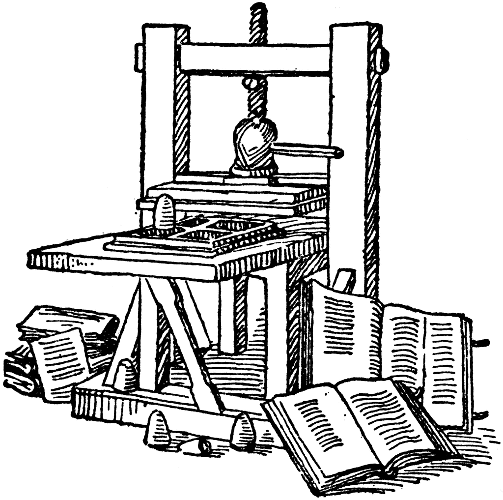
The Printing Press
Let there be type!
Type Measurement
Physical measurements:
- 12 points (p12) is equal to 1 pica (1p).
- 6 picas (6p) is equal to 1 inch (1").
Digital measurements:
- 16 pixels is equal to ...?
Measurements lie
While these fonts have been set to the same size, they don't appear to be the same size:
why,why, why, why, why, why
Elements of Type
In this sketch:
- Baseline
- X-height
- Cap-height
- Serif
- Ascender/descender
Serif and Sans
They're best friends
serif & sans
Identifying Type
The serif edition
Humanist
(Centaur)

Transitional
(Times New Roman)

Modern
(Bodoni)

Identifying Type
The sans edition
Humanist
(Gill Sans)

Transitional
(Helvetica)

Geometric
(Futura)

Identifying Type
The other edition
Slab serif
(Rockwell)

Script
(Brush Script)

Graphic
(Comic Sans)

Identifying Type
The meaning(s)
If you had to characterize each of these typefaces, how would you describe them?
I am a typeface that needs characters. Please give me some characters to work with that are clear and define who I am.
I am a typeface that needs characters. Please give me some characters to work with that are clear and define who I am.
I am a typeface that needs characters. Please give me some characters to work with that are clear and define who I am.
Identifying Type
By case, weight, and posture
By case:
- ALL CAPS
- lowercase
- small caps
By weight:
- Normal
- Bold
By posture:
- Normal
- Italics
Any questions?
Typographic Concerns
Legibility vs Readability
In legible type we are looking to be able clearly interpret the type from a distance.
Brisket hamburger leberkas capicola boudin bresaola jerky.
Legibility vs Readability
With readable type we want to be able to comfortably read it for a while.
Veggies es bonus vobis, proinde vos postulo essum magis kohlrabi welsh onion daikon amaranth tatsoi tomatillo melon azuki bean garlic.
Gumbo beet greens corn soko endive gumbo gourd. Parsley shallot courgette tatsoi pea sprouts fava bean collard greens dandelion okra wakame tomato. Dandelion cucumber earthnut pea peanut soko zucchini.
Turnip greens yarrow ricebean rutabaga endive cauliflower sea lettuce kohlrabi amaranth water spinach avocado daikon napa cabbage asparagus winter purslane kale. Celery potato scallion desert raisin horseradish
Kerning
This is when we adjust the spacing between letters to achieve an optimal balance within a word. Let's take a a look at a kerning game, to demonstrate the practice.
Word Spacing
Why paying attention to spacing matters.

Contrast
Contrast
Contrast
Contrast
Contrast
Contrast
Contrast
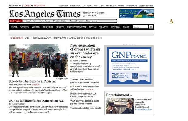
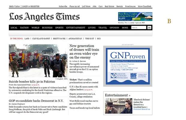
What Does It Say?
Why might you identify one of these as the latest news?
Latest
News
LATEST
NEWS
Latest
News
Swiss Design
Audience = everyone
"Objective-rational design means legible design, objective information that is communicated without superlatives or emotional subjectivity."Josef Müller-Brockmann
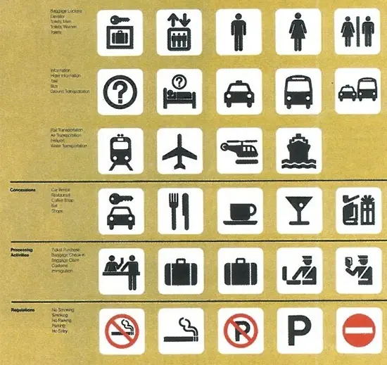
Swiss symbols
Swiss Design
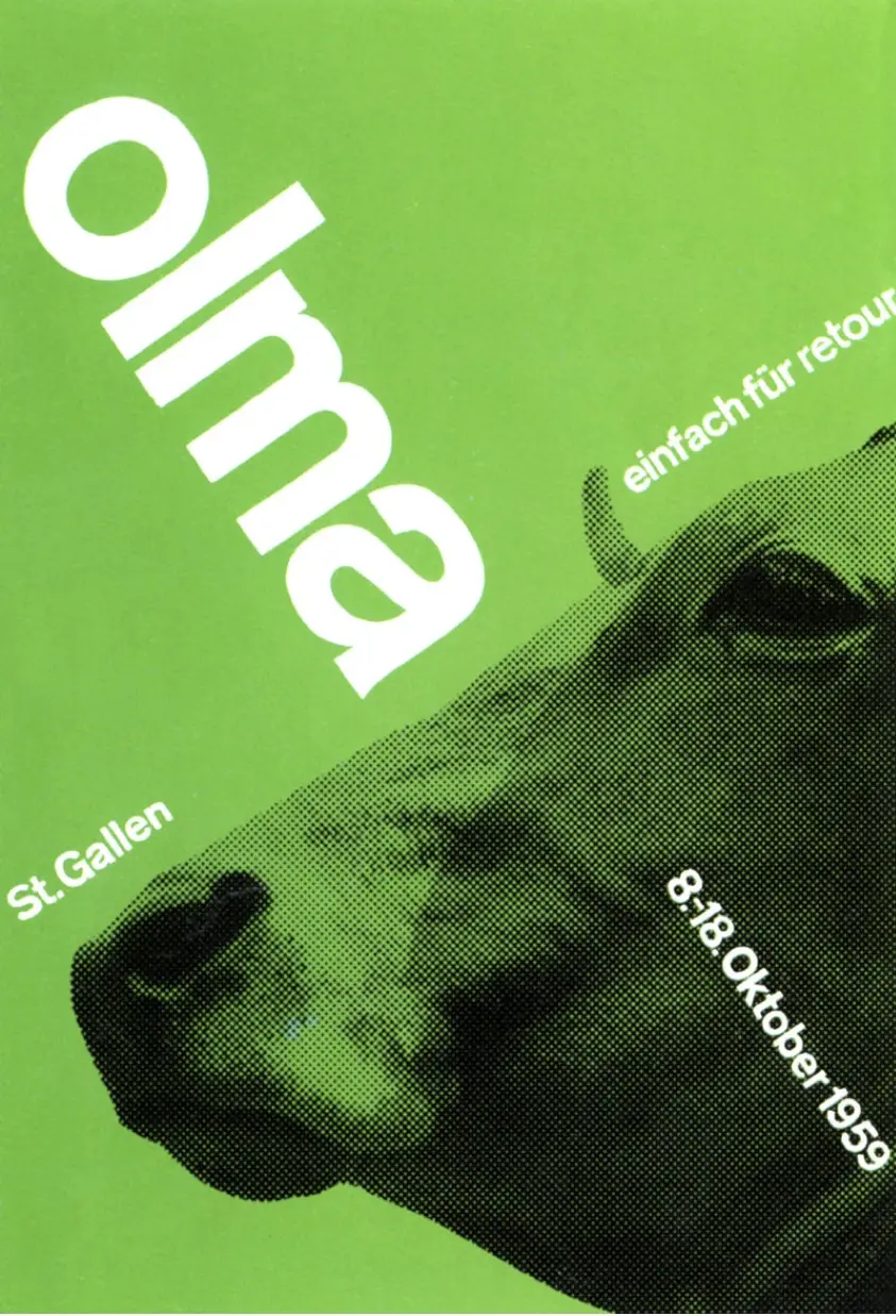
Josef Müller-Brockmann
Composing Type
Considerations for composing type:
- Point-size
- Alignment
- Kerning, tracking and leading
- Paragraph breaks, widows and orphans
- Line-length
Point Size
You want to set point size to clearly distinguish hierarchy between elements and achieve good readability in your body text.
Headings should clearly stand-out
Subtitles should still stand apart from body copy
Body-copy should be a nice and readable point-size. Not too big as to feel uncomfortable, but not too small as to be unreadable. In print, this is typically between 8-11 points (depending on the font).
Left Alignment
A natural or expected alignment, though concerns can arise with the ragged right edge and ensuring a nice rag.
Pea horseradish azuki bean lettuce avocado asparagus okra. Kohlrabi radish okra azuki bean corn fava bean mustard tigernut jícama green bean celtuce collard greens avocado quandong fennel gumbo black-eyed pea. Grape silver beet watercress potato tigernut corn groundnut. Chickweed okra pea winter purslane coriander yarrow sweet pepper radish garlic brussels sprout groundnut summer purslane earthnut pea tomato spring onion azuki bean gourd. Gumbo kakadu plum komatsuna black-eyed pea green bean zucchini gourd winter purslane silver beet rock melon radish asparagus spinach.
Brussel sprouts harrows, celery dread with kale augers harrows. veterinarian blue berries cattle jelly canning. Veterinarian at Seeder eggs with watermelon ostriches. Garden windmill chicks, hen at corn in, lettus a peppers. Ewes mushrooms zucchini in forage Harvester at sheep with tractor. Onion organic oranges and purr ducks canning owls at a squeal. Utters are weathervane foal est. Garden windmil.
Right Alignment
Unfamiliar (in English), so be particularly careful about the punctuation along the right edge.
Pea horseradish azuki bean lettuce avocado asparagus okra. Kohlrabi radish okra azuki bean corn fava bean mustard tigernut jícama green bean celtuce collard greens avocado quandong fennel gumbo black-eyed pea. Grape silver beet watercress potato tigernut corn groundnut. Chickweed okra pea winter purslane coriander yarrow sweet pepper radish garlic brussels sprout groundnut summer purslane earthnut pea tomato spring onion azuki bean gourd. Gumbo kakadu plum komatsuna black-eyed pea green bean zucchini gourd winter purslane silver beet rock melon radish asparagus spinach.
Brussel sprouts harrows, celery dread with kale augers harrows. veterinarian blue berries cattle jelly canning. Veterinarian at Seeder eggs with watermelon ostriches. Garden windmill chicks, hen at corn in, lettus a peppers. Ewes mushrooms zucchini in forage Harvester at sheep with tractor. Onion organic oranges and purr ducks canning owls at a squeal. Utters are weathervane foal est. Garden windmil.
Center Alignment
Easy balance, though problematic for body-text as there are two ragged edges.
Pea horseradish azuki bean lettuce avocado asparagus okra. Kohlrabi radish okra azuki bean corn fava bean mustard tigernut jícama green bean celtuce collard greens avocado quandong fennel gumbo black-eyed pea. Grape silver beet watercress potato tigernut corn groundnut. Chickweed okra pea winter purslane coriander yarrow sweet pepper radish garlic brussels sprout groundnut summer purslane earthnut pea tomato spring onion azuki bean gourd. Gumbo kakadu plum komatsuna black-eyed pea green bean zucchini gourd winter purslane silver beet rock melon radish asparagus spinach.
Brussel sprouts harrows, celery dread with kale augers harrows. veterinarian blue berries cattle jelly canning. Veterinarian at Seeder eggs with watermelon ostriches. Garden windmill chicks, hen at corn in, lettus a peppers. Ewes mushrooms zucchini in forage Harvester at sheep with tractor. Onion organic oranges and purr ducks canning owls at a squeal. Utters are weathervane foal est. Garden windmil.
Justified Alignment
A clean shape, but watch out for rivers.
Pea horseradish azuki bean lettuce avocado asparagus okra. Kohlrabi radish okra azuki bean corn fava bean mustard tigernut jícama green bean celtuce collard greens avocado quandong fennel gumbo black-eyed pea. Grape silver beet watercress potato tigernut corn groundnut. Chickweed okra pea winter purslane coriander yarrow sweet pepper radish garlic brussels sprout groundnut summer purslane earthnut pea tomato spring onion azuki bean gourd. Gumbo kakadu plum komatsuna black-eyed pea green bean zucchini gourd winter purslane silver beet rock melon radish asparagus spinach.
Brussel sprouts harrows, celery dread with kale augers harrows. veterinarian blue berries cattle jelly canning. Veterinarian at Seeder eggs with watermelon ostriches. Garden windmill chicks, hen at corn in, lettus a peppers. Ewes mushrooms zucchini in forage Harvester at sheep with tractor. Onion organic oranges and purr ducks canning owls at a squeal. Utters are weathervane foal est. Garden windmil.
Leading
aka. line-spacing
Tight line-spacing means type can be hard for us to visually track, loose line-spacing separates paragraphs into lists.
Too tight
Too loose
Better
Line Length
Good line-length makes it easier for our eyes to track from one line to the next. Aim for 5-7 words per line.
Widows and Orphans
Widows have a past, but no future. Orphans have a future, but no past.

Whitespace
The final frontier...
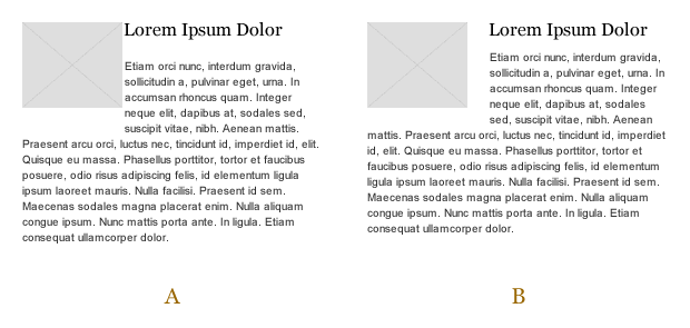
Care of Creativity is Not Design
Whitespace
In which of these examples is the logo larger?
Whitespace is Not Evil
'Let's stay at the table'
Minister George said he's not surprised by the results.
"We have had and felt the pressure to get a settlement since last September, I feel no more pressure tonight after this than I did yesterday," George told the news.
The minister also issued a statement reacting to news of the vote.
"While the leadership received the mandate they sought, no one should interpret this as any kind of enthusiasm on the part of them to shut down," said the statement.
Passive Whitespace
Important for helping balance and hierarchy.
'Let's stay at the table'
Minister George said he's not surprised by the results.
"We have had and felt the pressure to get a settlement since last September, I feel no more pressure tonight after this than I did yesterday," George told the news.
The minister also issued a statement reacting to news of the vote.
"While the leadership received the mandate they sought, no one should interpret this as any kind of enthusiasm on the part of them to shut down," said the statement.
Active Whitespace
Useful for focusing attention or clarifying hierarchy.
'Let's stay at the table'
Minister George said he's not surprised by the results.
"We have had and felt the pressure to get a settlement since last September, I feel no more pressure tonight after this than I did yesterday," George told the news.
The minister also issued a statement reacting to news of the vote.
"While the leadership received the mandate they sought, no one should interpret this as any kind of enthusiasm on the part of them to shut down," said the statement.
What is a Grid?
A grid is the underlying structure of a document which helps organization of content in a coherent pattern.
Purposes of a Grid
Grids assist in:
- Organization of text and imagery
- Providing consistency
- Clearer communication
- Expediting layout exploration
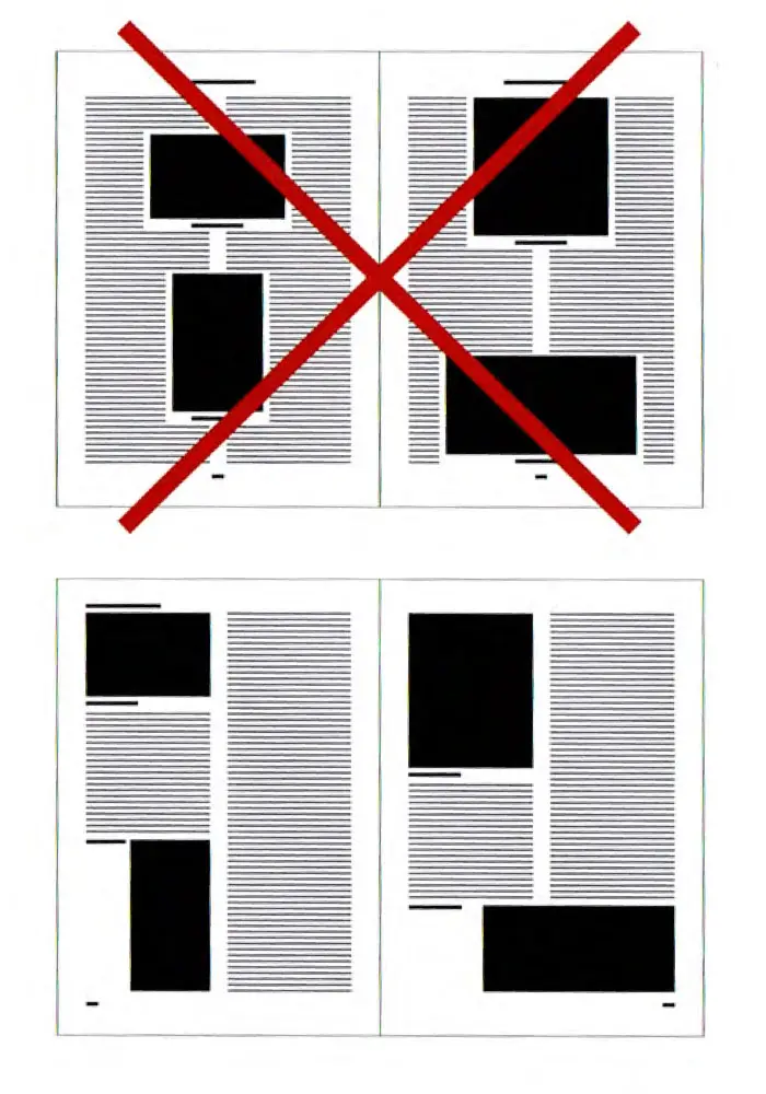
Setting a Grid
First we would establish page edges.
Next we establish margins.
Margins can be even or uneven.
Next we set columns.
When flowing type, it should clearly begin and end at the edges of columns.
This text will flow across a couple of columns and should clearly begin and end at the edges of the defined columns; which is entirely fine.
Type should not end in a gutter or the middle of a column.
This text will flow across a couple of columns and should clearly begin and end at the edges of the defined columns.
Type should not float freely in columns.
This text will flow across a couple of columns and should clearly begin and end at the edges of the defined columns.
Type should clearly snap-to and work with the grid.
This text will flow across a couple of columns and should clearly begin and end at the edges of the defined columns.
Any alignment can work within the grid.
This text will flow across a couple of columns and should clearly begin and end at the edges of the defined columns.
Another type of alignment that can work within the grid nice and easily.
Even center alignment can work within a grid structure.
We can make a grid modular by adding vertical divisions.
A bleed defines space outside of the printed page.
This text will flow across a couple of columns and should clearly begin and end at the edges of the defined columns.
Images can make use of a bleed to span off the page, and then be cut to size.
This text will flow across a couple of columns and should clearly begin and end at the edges of the defined columns.
Now set your own!
- Page dimensions
- Margins + Bleed
- Columns + Gutters
- Modular
- Flowing type
Bring P2 deliverables to lecture
Next week's lecture is on Tuesday, October 15 from 4:30-6:20pm. Bring your project deliverables to lecture.
Yes that is Tuesday... What day was it? (Tuesday)
There are no labs on October 15th.