ah teaches web design & development (Devices and their Fickle Owners lecture)
Devices and their Fickle Owners
Lecture outline
Thinking about how users use websites, and more options for laying out your site. Lecture slides will be made available on the day of the lecture (October 10).
Critique prep
Please come and sign-up for a timeslot for critique. I will briefly cover alternative activities you can partake in during critique time.
Please make sure to have materials ready for critique when your timeslot comes up.
In preparation for lecture...
Please close up any laptops, cellphones, BlackBerries, Atari 2600's and other 'beep-boop' devices.
PSA: SIAT Undergraduate Town Hall
SIAT has a number of curricular changes coming up. Hear from faculty, ask questions and provide feedback at 12:30pm on Tuesday, October 15 (2024) in SRYC 5140. Free food and beverages will be provided.
Recognizing the impact that the loss of Russell Taylor has had, SIAT Advising and other SFU student support will be present at the meeting.
Please RSVP at siats.ca/townhall2024
Any questions about the event can be directed to Andrew Hawryshkewich (UCC Chair) at andrew_h@sfu.ca
P1 code reviews
Devices and their Fickle Owners
Points on breakpoints
How to aim for optimal breakpoints?
- Let your content decide
- Use relative units (always)
- Avoid an absolute process

"You can play Doom Eternal on a Fridge" (ExtremeTech)
Progressive enhancement
Build up from the basics
The layering of progressive enhancement:
- Content: Ensuring that the basic content works (clean, semantic, HTML).
- Styling: Applying styling and testing across devices (caniuse.com).
- Scripting: Enhancing the experience as much as possible.
Advanced progressive enhancement
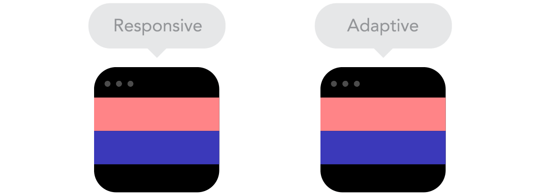
(aka. Responsive Web Design)
We are taking a device-agnostic approach, as the screen isn't our only variable:
- Problematic browsers
- Slow connections
- Small screens
- Touch first
- Content structure
- ... etc.
Degredation vs. enhancement
Wait, so what's different?
Graceful degredation: Build for the biggest and bestest, making sure that the site is still usable for 'lower-class' browsers.
Progressive enhancement: Build a common standard for all browsers (upper and lower class), then offer additional functionality for browsers which can use it.
Responsive images
Thinking about when and how to use responsive images includes a variety of factors:
- User's resolution or screen sizes
- Dimensions of the image
- Breakpoints
Sizing images
When sizing images, consider the maximum pixel dimension the image would be displayed at and the possible pixel density of the device.
Positioning
One way to move things on the web
Some options:
- static — the default, things occur as ordered in the HTML
- relative — similar to static, but allows for further instructions through 'left', 'right', 'top', 'bottom' to move relative to its original position
- absolute — positions relative to the viewport through 'left', 'right', 'top', 'bottom'
- fixed — similar to absolute, but will not scroll (stays in view)
- sticky — fixed within container, relative otherwise
Today's code tutorial
Please download:
- The positioning starter kit from 339.ah.link/t04
- The responsive images starter kit from 339.ah.link/t05