ah teaches interface design (Aesthetic Assessment lecture)
Aesthetic Assessment
Lecture outline
More on affordances and heuristic assessment of interfaces. Lecture slides will be made available on the day of the lecture (May 22).
Critique prep
Please come and sign-up for a timeslot for critique. I will briefly cover alternative activities you can partake in during critique time at 9:45, after which we will reconvene for lecture at 11:30.
Please make sure to have materials ready for critique when your timeslot comes up.
Activities during critiques
Peer critiques:
- Use a 'flag' to find others who want to talk through their work as well.
- Use one of the exercise sheets to solicit further feedback on your initial features
Complete a reading reflection:
- Collect the reflection worksheet from the black folder
- Submit your completed reflection to the black folder
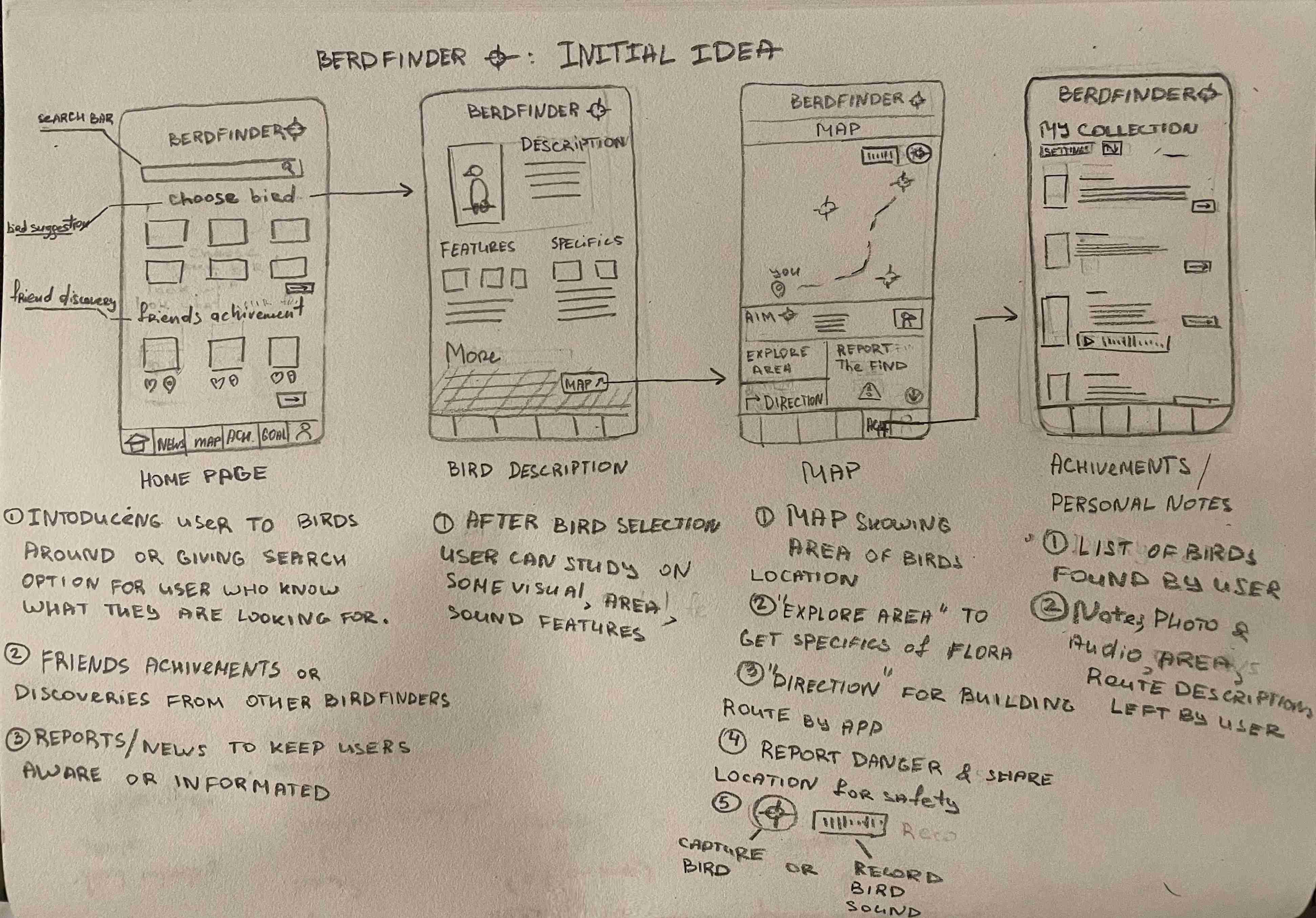
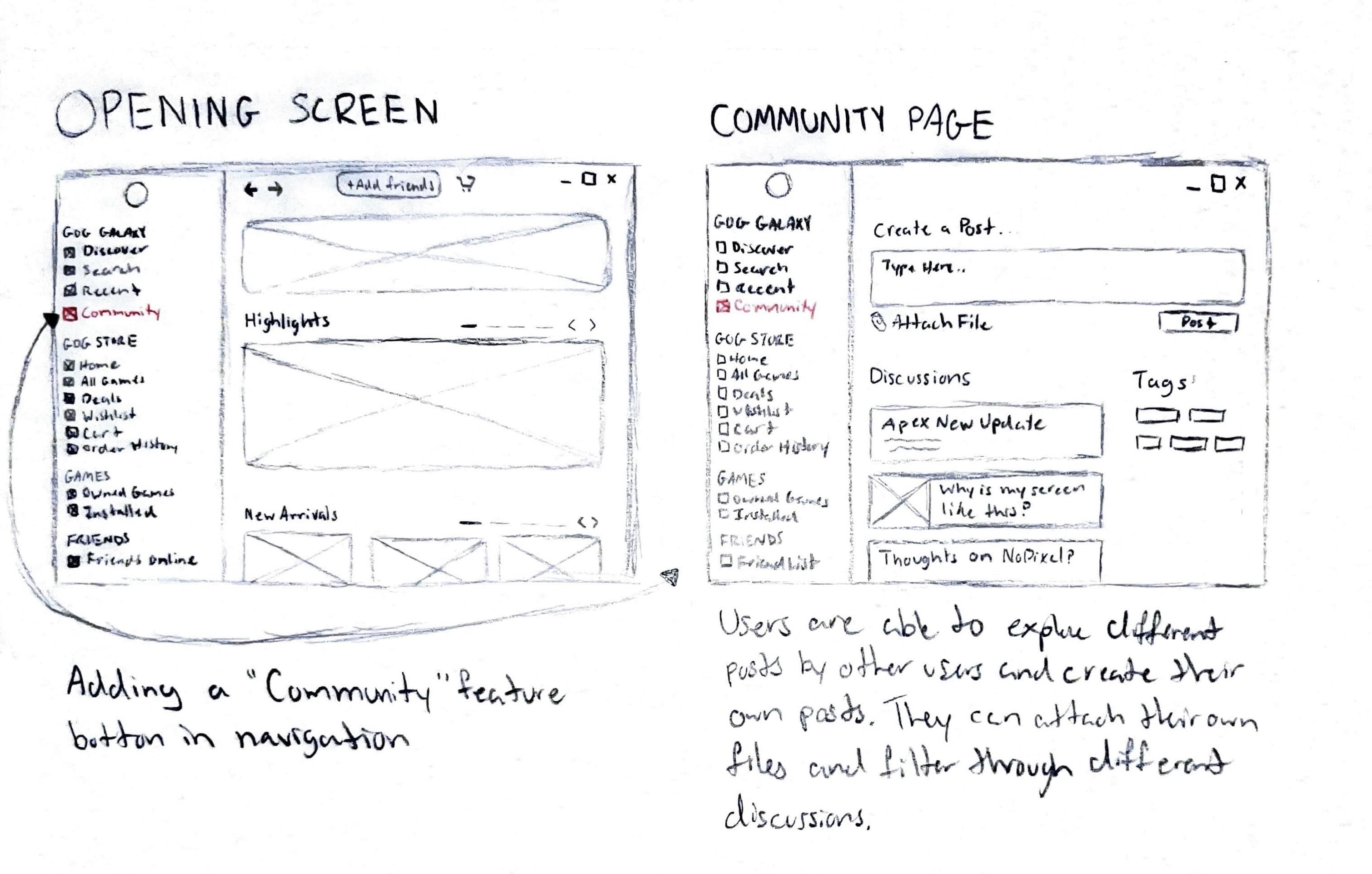
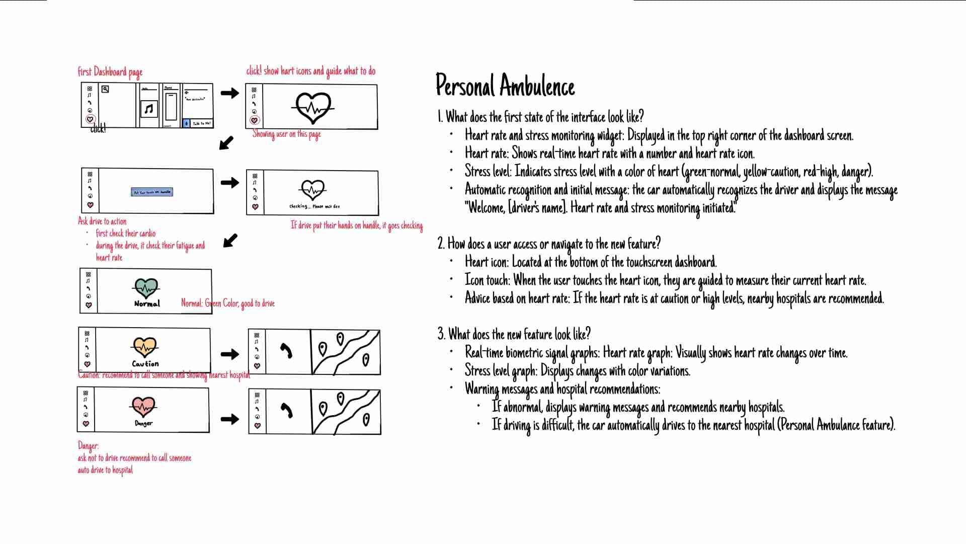
Sketch feedback
There was more use of sketching and step-by-step explanations this time (woohoo!), but...
- Some oversimplified something very complex in scope.
- Be careful about 'one dimensional' features; I do the thing, but nothing else.
Evaluative research
We are trying to assess an existing item. In the context of this course this will mostly focus on the usability of an interface.
In this course we will make use of Nielsen's 10 Usability Heuristics.
Heuristics
These are 'best practices' discovered over years of trial and error; or from research.
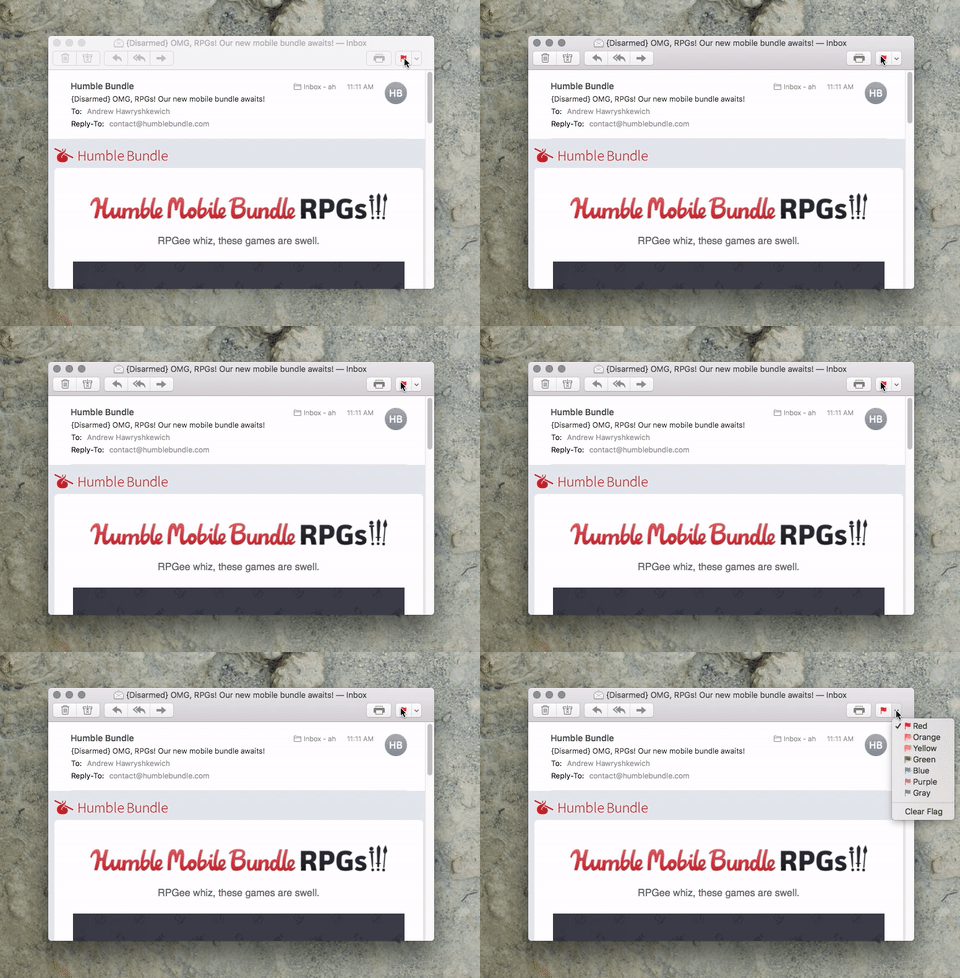
Visibility of system status
The system should keep users informed about what the system is doing.


Match between system and the real world
The system should work with the user's language — words, phrases, and concepts.
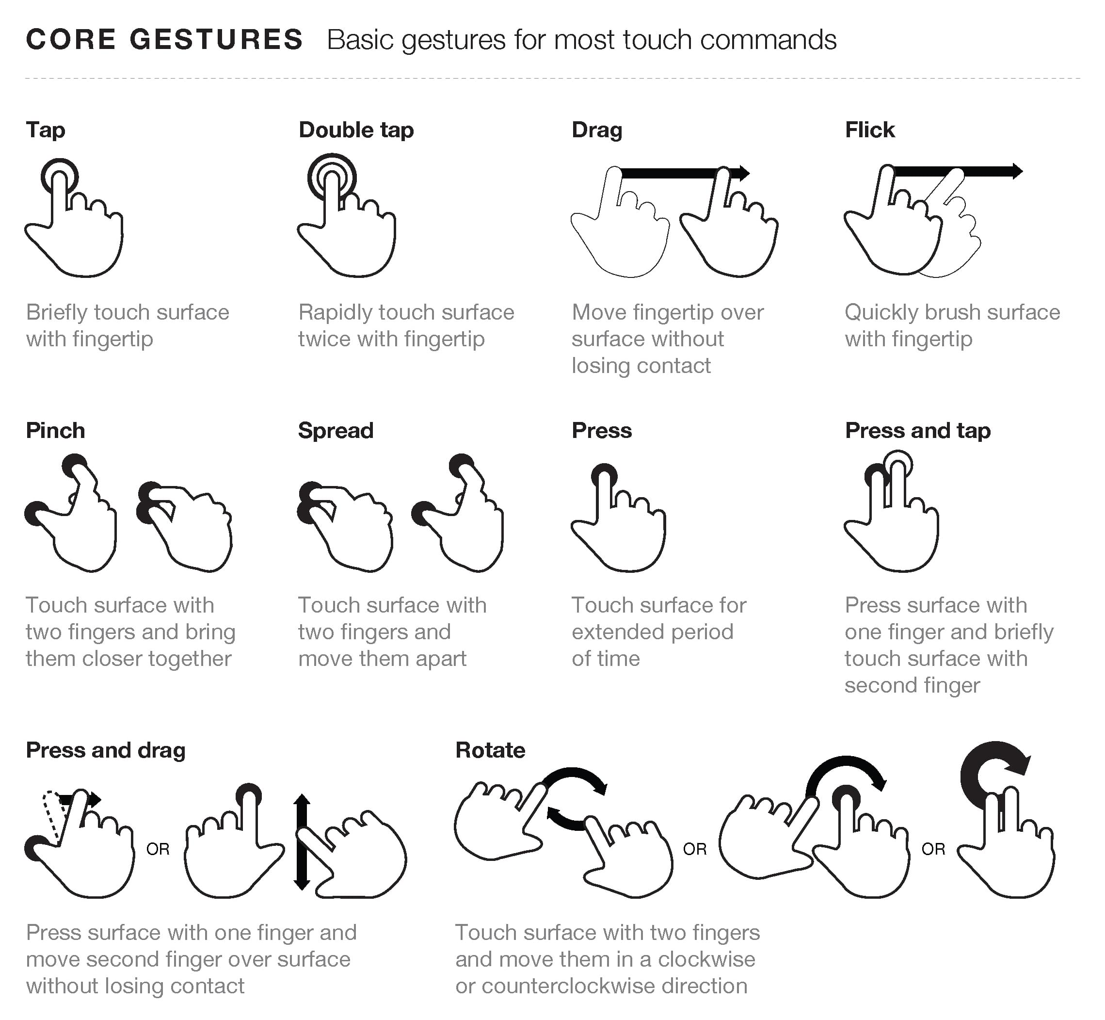
User control and freedom
Users make mistakes and should be able to easily exit from an unwanted action.
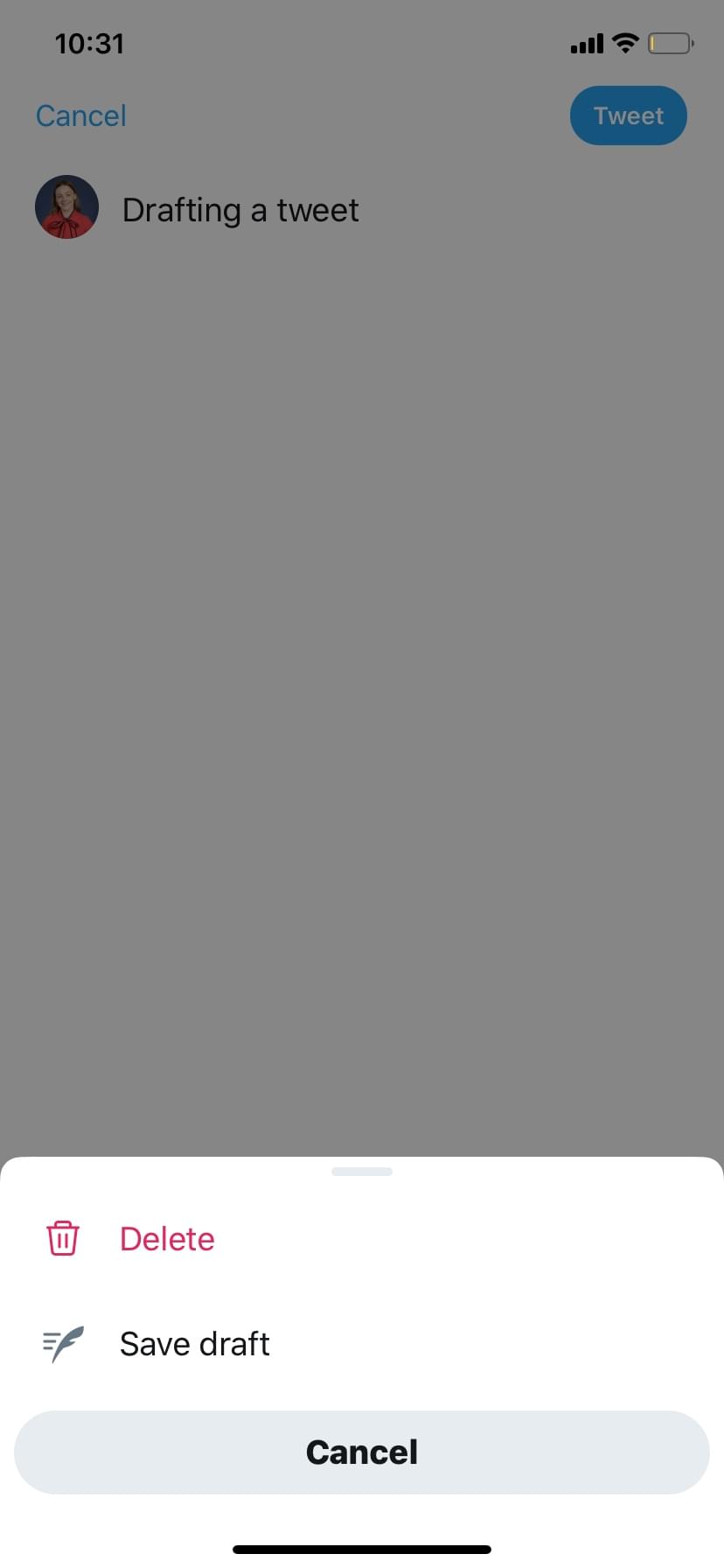
Care of Nielsen Norman Group
Consistency and standards
Ensure consistency within your design (internal consistency), and between your design and other products (external consistency).
Internal and external consistency
Internal
Inside one application or a family of applications under the control of a company (i.e. Adobe Creative Suite).
External
Established conventions in an industry or across applications at large (i.e. ctrl+c or command+c).
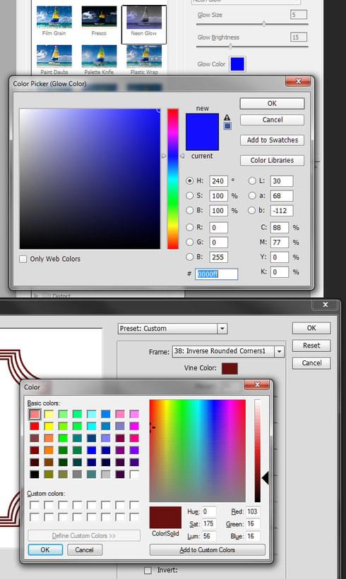
Rubric moment
From the P1 rubric: "The feature integrates seamlessly integrates with the existing interface."
Please trade P1 with a neighbour and take 5 minutes to review a proposed feature. Some possible questions:
- Does it look consistent with the existing interface?
- Does the interaction appear consistent with the existing interface?
- Why are you convinced (or not)?
Error prevention
Aim for careful design which prevents a problem from occurring.
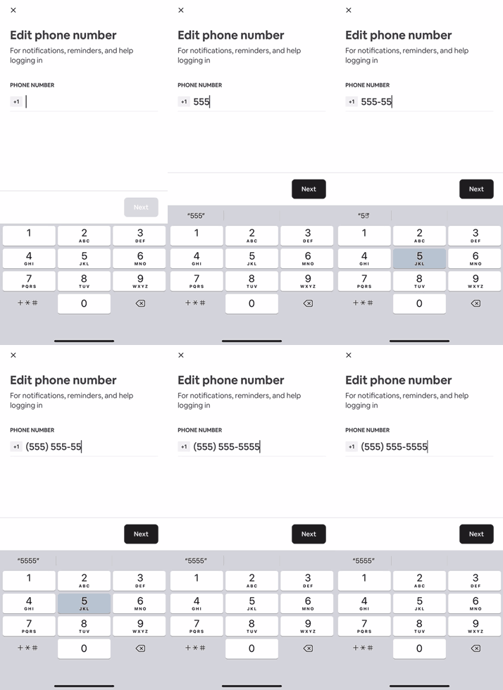
Recognition rather than recall
Reduce the amount of memory use. Make options visible and do not require the user to remember something between two states.
Flexibility and efficiency of use
Shortcuts for expert users allows an interface to cater to inexperienced and experienced users.
Aesthetic and minimalist design
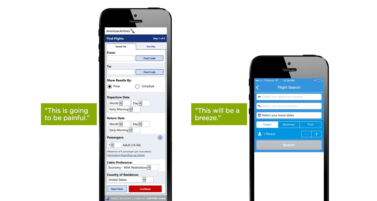
Provide only the necessary content and visuals for the user to accomplish their goal.
Rubric moment
From the P1 rubric: "The designed feature provides an exceptional design — legible, clear hierarchy, excellent use of space/composition, interactions, and consistent elements."
Please trade P1 with a neighbour and take 5 minutes to review a proposed feature. Some possible questions:
- Does the design of the interface appear visually complex or visually simple?
- Does it use the complexity or simplicity well?
- Why are you convinced (or not)?
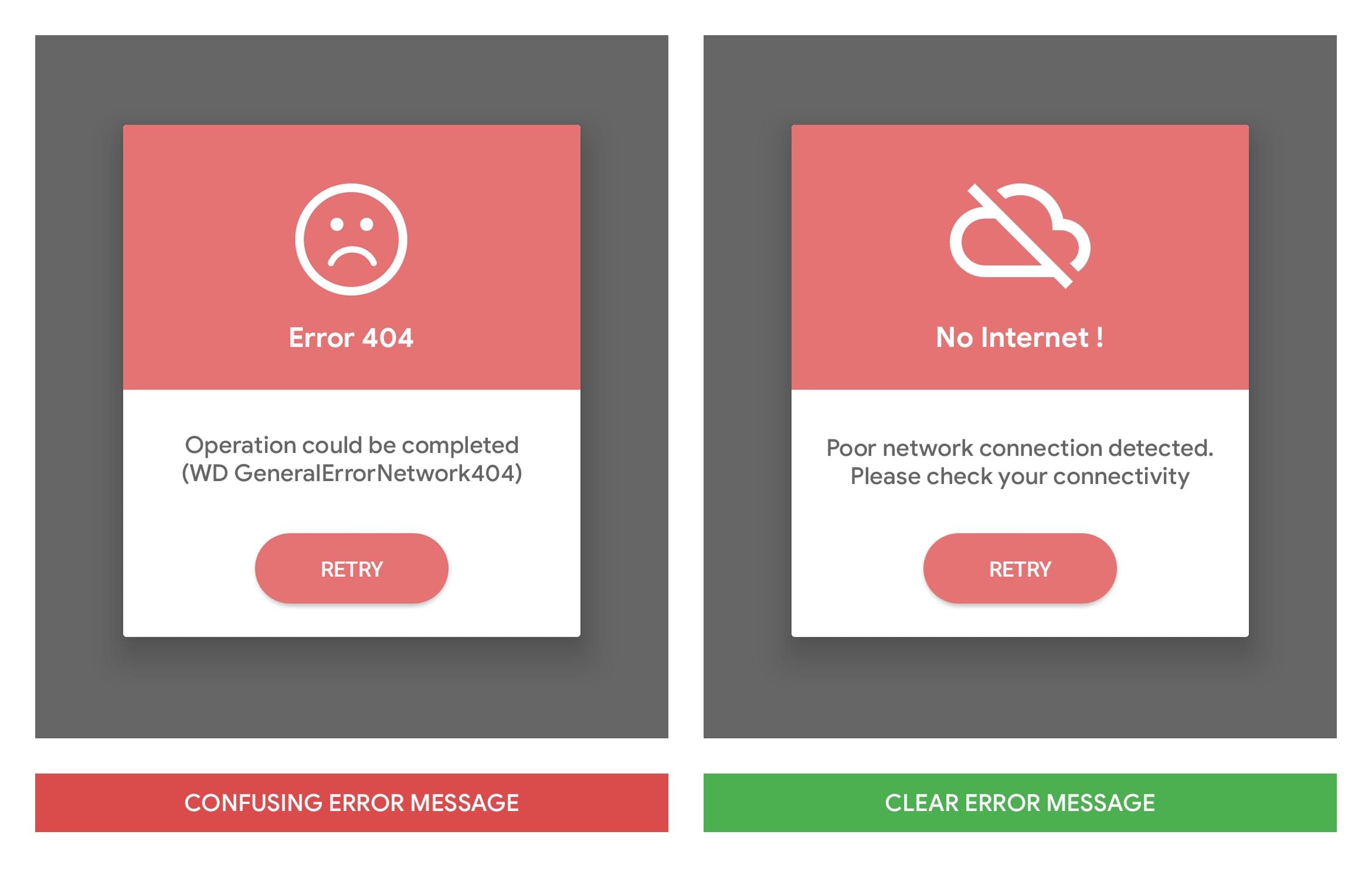
Help users recognize, diagnose, and recover from errors
Error messages should be understandable to the user and suggest solutions.
Help and documentation
It is better if documentation is not needed, but it may be necessary to help users complete a task.
P1 submissions
P1 is due before our class time next week. Please make sure to submit to Canvas before class and be prepared for a 'peer critique' in the early half of lecture.
P1 special offer
If you feel strongly about wanting to present your project scenario instead of using a short video or webpage we will have space in class time for six (2-minute) presentations.
Please reach out to Andrew if this is of interest to you.
Inclusive Design for Mental Health & Cognition
At 11am next week (after critiques) Amanda Poh, designer at Microsoft and SIAT alum, will shares an overview of Microsoft's latest Inclusive Design toolkits. Learn about cognitive demands and principles to support users with diverse cognitive and mental health needs.
Friends are welcome to attend at 11am as well.