ah teaches interface design (Aesthetic Affordances lecture)
Aesthetic Affordances
Lecture outline
Considering guidelines and affordances in designing interactions. Lecture slides will be made available on the day of the lecture (May 15).
Critique prep
Please come and sign-up for a timeslot for critique. I will briefly cover alternative activities you can partake in during critique time at 9:45, after which we will reconvene for lecture at 11:30.
Please make sure to have materials ready for critique when your timeslot comes up.
Critique
Critique is a communication skill. Effective critique requires reading/listening, responding, and practice.
Critique context
Before giving critique, it is always important that you understand what the project is, and where it is at. This helps ensure your feedback will be timely and purposeful.
Activities during critiques
Peer critiques:
- Use a 'flag' to find others who want to talk through their work as well.
- Use one of the exercise sheets to solicit further feedback on each other's work
Complete a reading reflection:
- Collect the reflection worksheet from the black folder
- Submit your completed reflection to the black folder
First reflection notes
Keep it on-topic. In response to "What is your takeaway?":
"Average design is ignored, good design attracts people and is remembered. Persuasion is a key in making design work successful. I easily understand the four elements of persuasion in the reading. Every user has their background and needs for their goals. Every design should be based on what the designer is aiming to pursue about the objective."
First reflection notes
Tell me your opinion. In response to "Why is this your takeaway?":
"To persuade people we need to use heuristic processing to capture their attention. Because once they pay attention and caputer the information they will be drawn into the design. For example a website that provides information with good design will attract more users."
First reflection notes
Be consistent/clear in what you are referring to.
In response to "What is your takeaway?":
"My takeaway would be agreeing to the importance of the 'message' in persuasion."
In response to "Why is this your takeaway?":
"One example is how I scanned the reading in the form of heuristic processing and then alter on when checking the relevance and reliability of the information."
Behaviours & Interactions
Interfaces are dynamic. They are the means by which a user controls and interacts with a complex tool. As a result it is important that we understand the capabilities and behaviours of the product and the user.
What is an 'intuitive' interface?
User and System Behaviours
As interface designers we have to reconcile user expectations and system functions. Note that our job is not to map them directly.
Interactive System Models
Implementation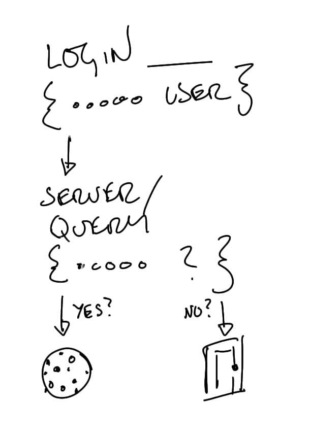
Representational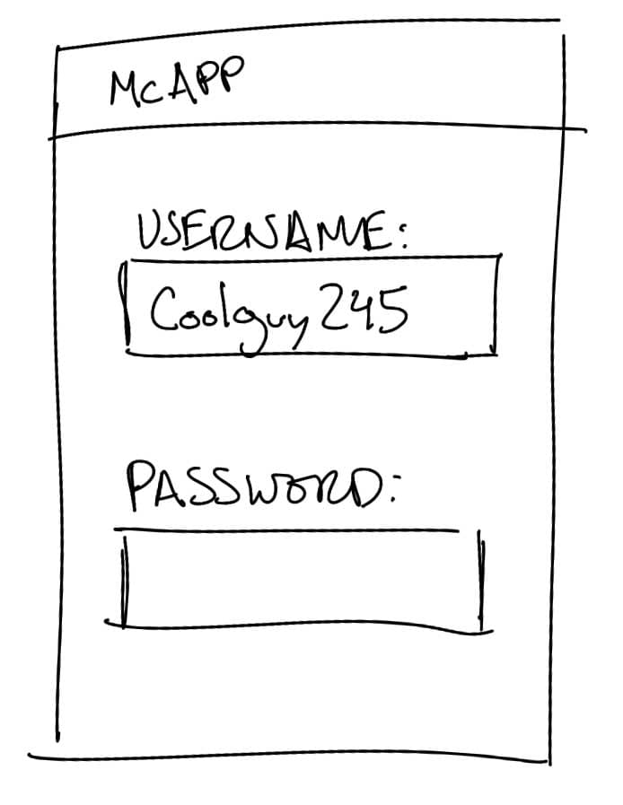
Mental
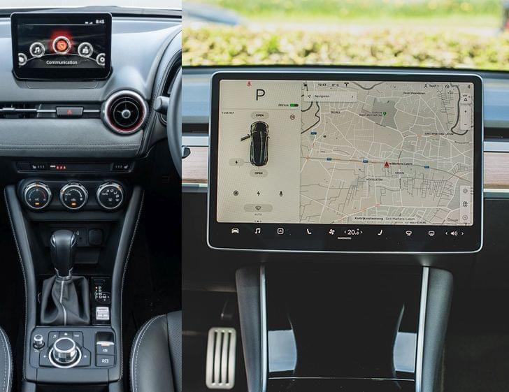
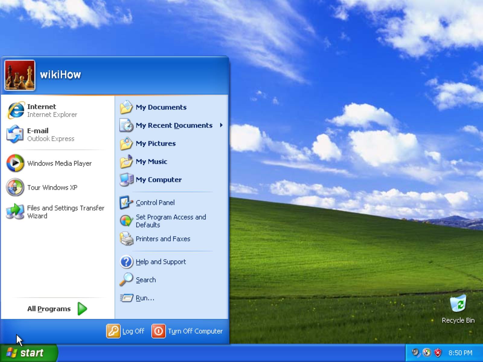
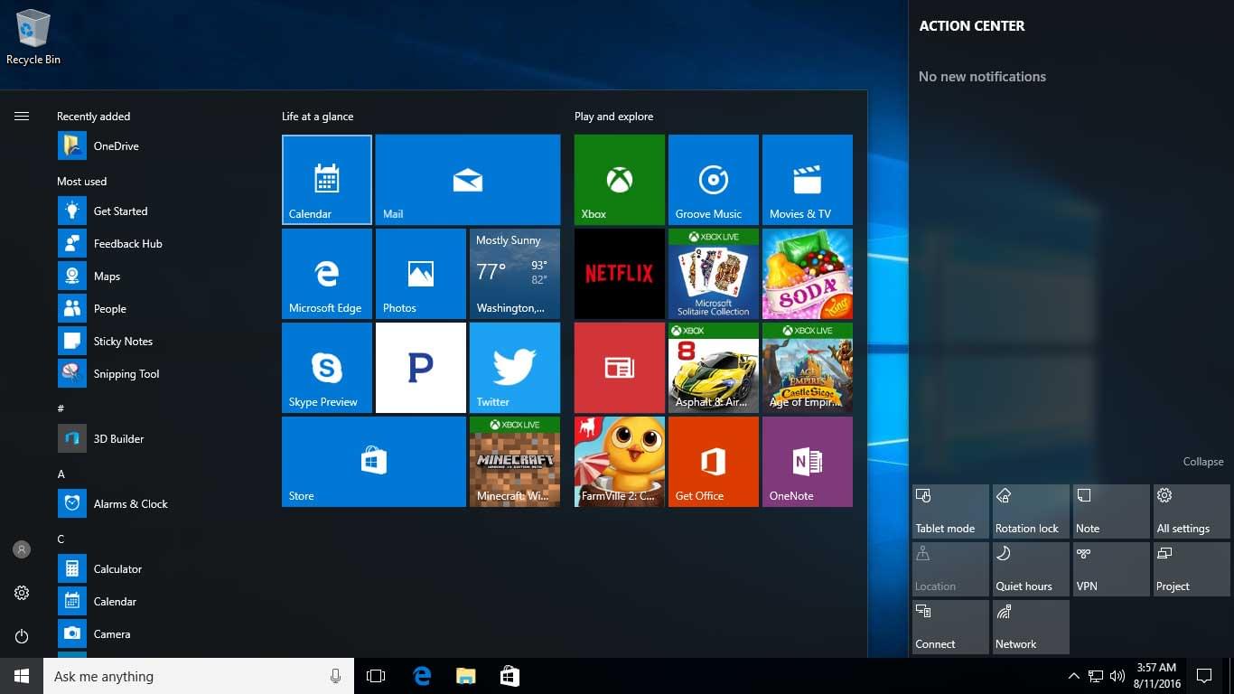
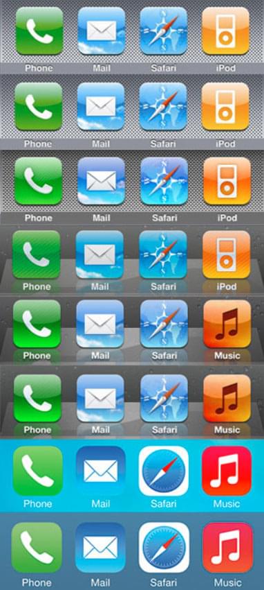
Skeuomorphism
The use of physical, visual, and conceptual represetations that resemble or mimic older, typically physical, elements in order to make them more easily understood, recognized and adopted by a user.
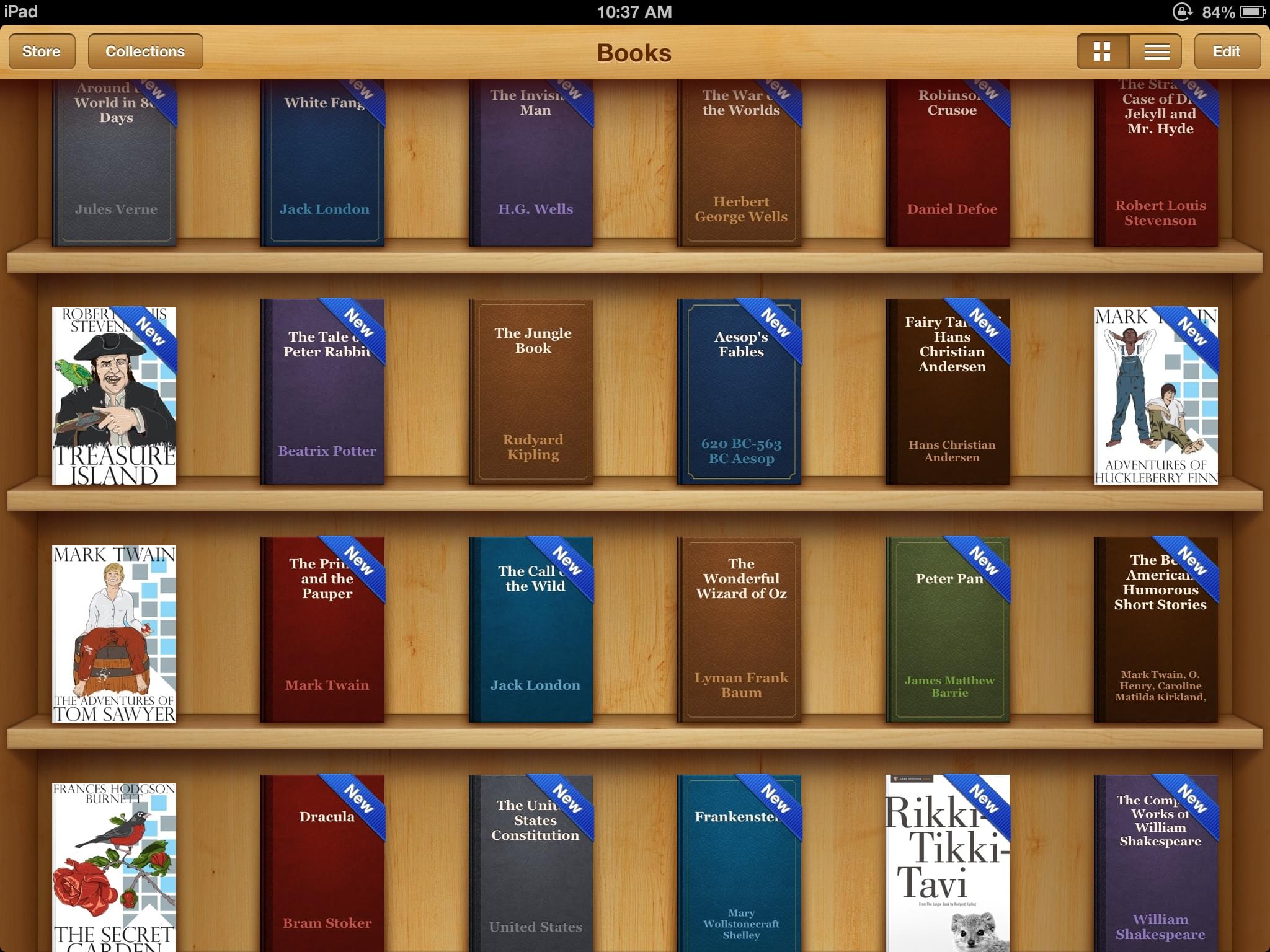
A book organizing application that looks like a bookcase
Candies that look like candies might sitting out on a (very organized) table
Don't Hate, Consider-it!
While skeuomorphism may not currently be considered 'trendy', the benefits in usability from using real-world cues should not be mocked!
Note: Do not connect to the internet
Design Languages
Visual languages such as Google's Material Design, Apple's Human Interface Guidelines, Microsoft's Fluent Design System are just a couple examples of pattern libraries of visual and interaction elements. These standardize interactions within a given platform, allowing for branding an extendability.
User Goals
Our design should be driven by our user's goals — a desired outcome or intended experience. The challenge is that a user's goals can span from well-defined to unintelligible.
Example: Find the nearest whisky jack (also known as a grey jay).

This is confusing, but important
P1 and features
This is where defining a feature comes into play. With a 'feature' we are typically trying to answer some (or all) of:
- What goal the feature accomplishes for the user.
- What task(s) the feature is enabling the user to complete.
- What challenge the feature lessens for the user.
- What benefit the feature will provide the user.
Tasks and goals
While our design is driven by the goals of our user, we will need to break up the goal(s) into a series of tasks to help us build the representational model needed.
Designing Interactions
Don't design in a vacuum. Look at existing systems and try to understand why they work the way they do. And how you can use that to make your own system function "intuitively."
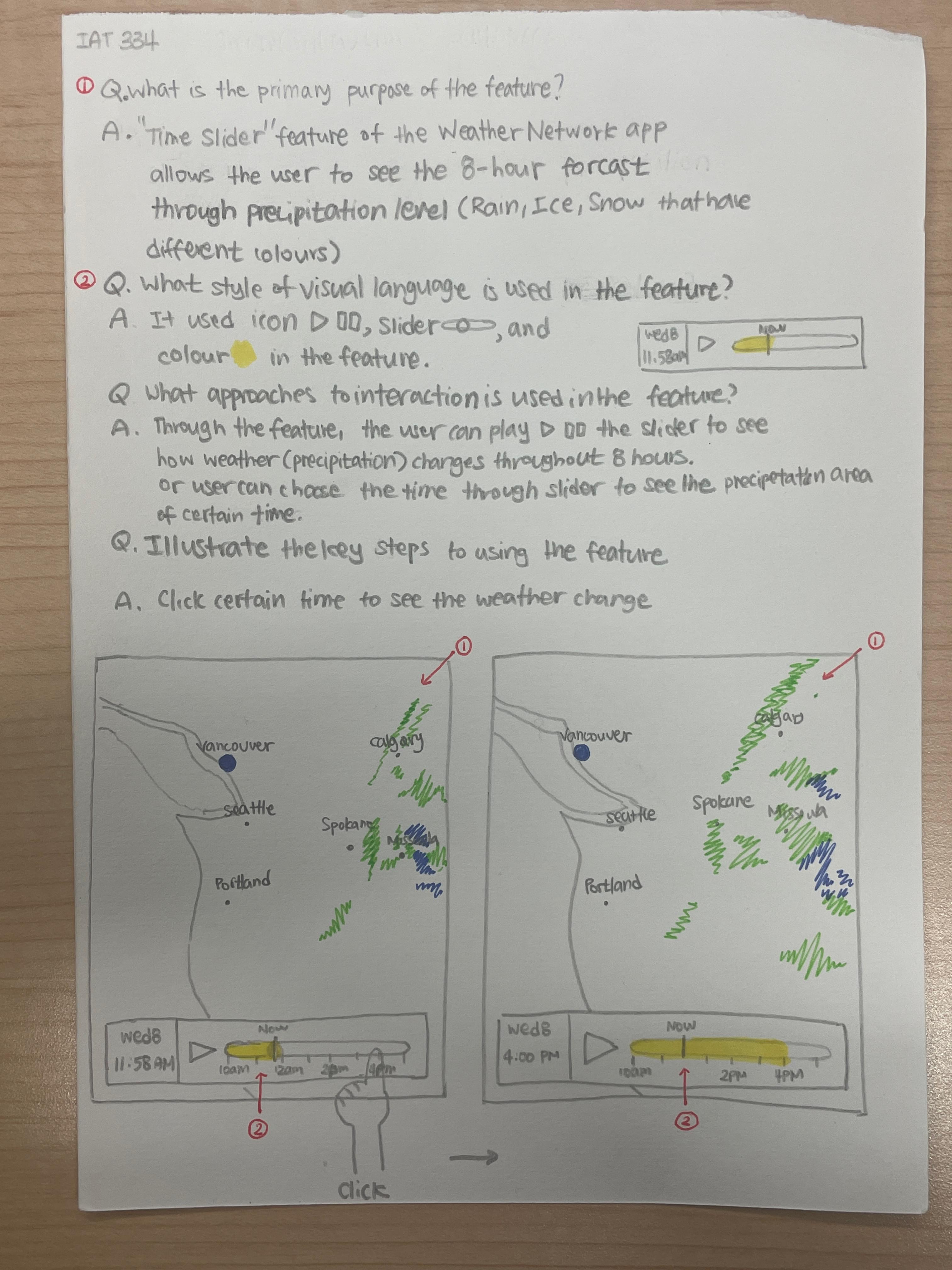
Sketching exercise comments
Some things to consider and/or improve upon:
- Giving us enough details to understand the interface (if we didn't know the interface)
- Scoping down to one 'feature': What is a task or goal the user needs to accomplish? What is needed for that?
- Being clear about what 'action' is being taken: a click, tap, drag, scroll, etc.
- Sketch please! We don't need a novel, we need a comicbook!
Guiding Through Interaction
Consider:
- How do you focus the attention of the user?
- How do you ensure your users don't get lost?
- How is the logic of the action conveyed/represented?
P1 scenarios
Suggested steps
- Write out a narrative and map out how it fits together in a flow-chart.
- Sketch out the wireframes necessary to illustrate the flowchart.
- Add comments or elements to the sketches to help us understand the entire scenario.
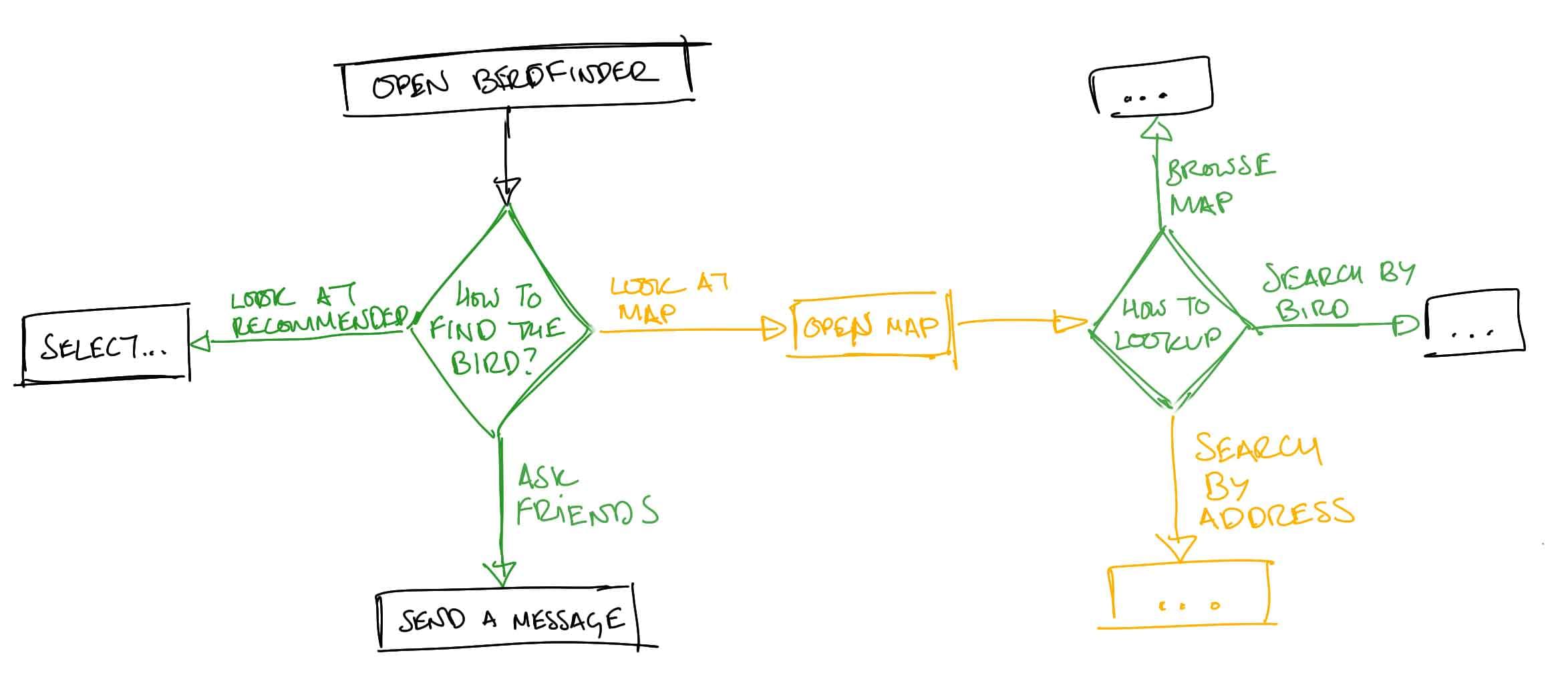
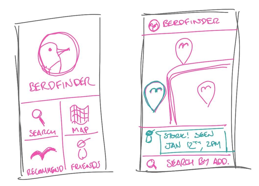
A sample feature narrative
Andrew wants to find the nearest whisky jack to snap some photos of. He opens up the Berdfinder interface and decides how he might want to find them. Wanting to find the nearest one he chooses the map option. There he is able to put in his address and look around the map for the closest whisky jack sighting.
A short narrative for using your UI.
Andrew wants to find the nearest whisky jack (goal) to snap some photos of. He opens up the Berdfinder interface and decides how he might want to find them (options). Wanting to find the nearest one he chooses the map option (decision). There he is able to put in his address (options/decision) and look around the map for the closest whisky jack sighting.
For lecture...
For the next lecture time, please make sure to come ready to critique!