P3: Wireframes (due March 11)
Introduction
Wireframing is a means by which we start to explore the structuring of information and content in digital, interactive contexts. This project provides you with context for a website and asks you to think about how to structure and lay out the content on mobile and desktop platforms.
This project is completed in teams of two or three.
P3: Wireframes is worth 25% of your final grade.
This term's context
For both P3 and P4 we will be working with the Embark Sustainability Society to propose an alternative to their Find Your Climate Community flowchart. This alternative should clarify the information provided through an interactive website.
You are welcome to:
- Organize or reorganize the content as long as relationships stay consistent with the original flow-chart.
- Re-label or re-write link text and headings for clarity.
You are not expected to work within Embark's branding for this project. There is an Embark Sustainability style guide available if of use.
Weekly instructions
This project spans multiple weeks. Please read the weekly instructions carefully.
From February 12 to February 26
The first week is about getting set up to work collaboratively, as well as to learn the basics of Figma — our wireframing tool for the term.
Please complete the following:
- As a group complete the team contract. Bring a printed copy to the next lab.
- Individually complete the Embark Sustainability Project Agreement. If you have any questions or concerns about the agreement, please do not hesitate to email Andrew.
- If unfamiliar with Figma, please complete the Figma Basics online tutorial. This tutorial will cover from setting up an account and building out your first file.
- Individually sign-up for the educational plan with Figma. This will allow you to have access to some features that will make working remotely with your groupmates easier.
- As a group sketch an information architecture for the website. Working through the Find Your Climate Community flowchart and thinking about the context, propose an information architecture that you believe would work best for making the flowchart's content more understandable.
- Based on the information architecture, individually create low-fidelity hand-sketched wireframes of each website section proposed. The wireframes should:
- Use a consistent grid structure.
- Show us the hierachy of content.
- Show us the layout of content.
- Show us both desktop and mobile sizing.
- Be at most 4cm wide.
- Extend downwards to illustrate content as needed.
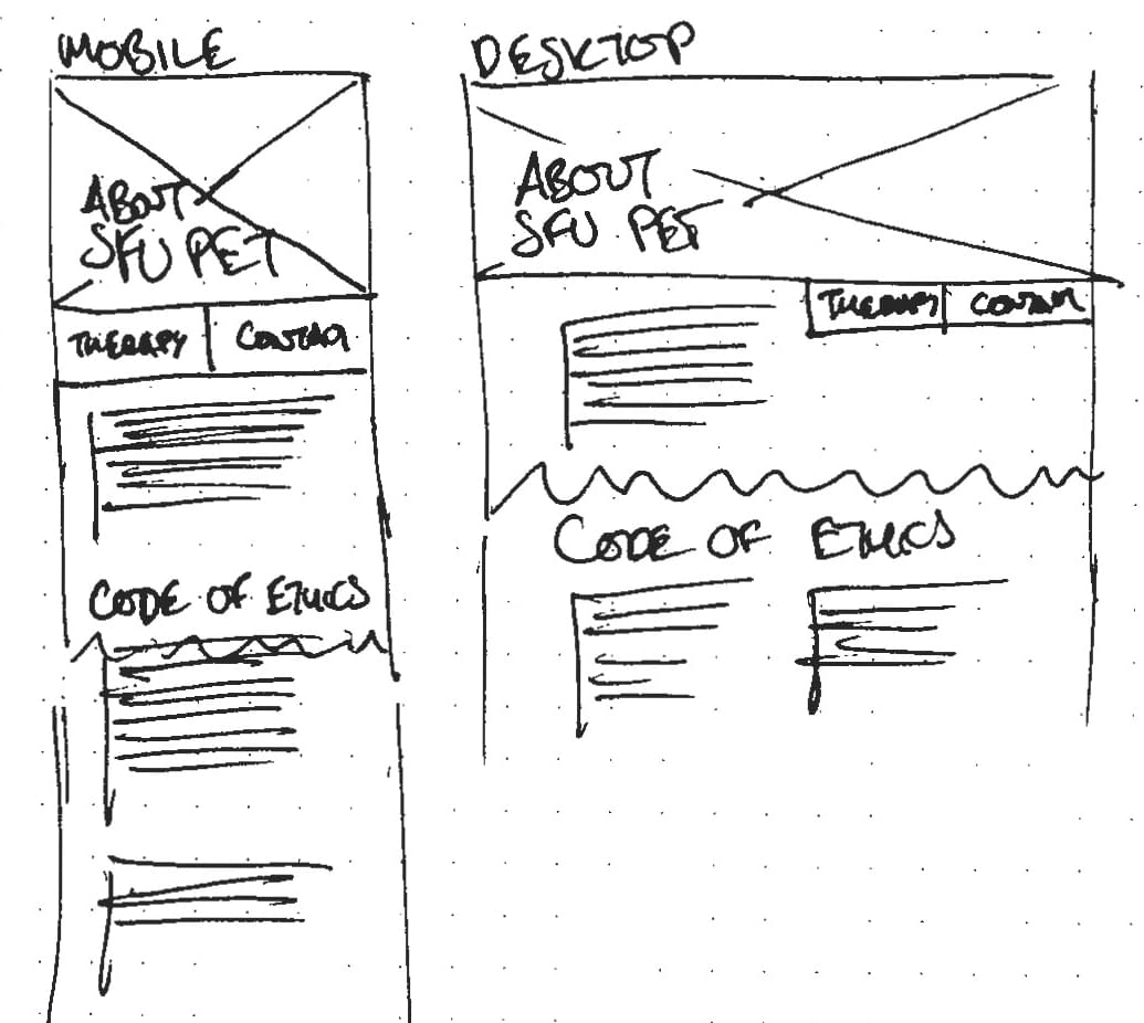
A sample of low-fidelity wireframes showing both the mobile and desktop sizing with additional content extending "below the fold" as needed.
Bring to your February 26 lab
- Your filled in team contract
- A sketch of an information architecture
- A set of hand rendered wireframes
We will discuss your deliverables in lab.
From February 26 to March 4
In this week you will be generating wireframes in Figma. They should illustrate the different sections of the website and how they link together.
Please complete the following:
- Considering the feedback from the prior labs, as a group write down a set of guidelines and rationale that will direct your wireframes. These guidelines and rationale should communicate approaches you will take to resolve the design problem. This may include:
- Audience-specific considerations
- Layout or hierarchy considerations
- Content focus
- Individually generate a set of medium-fidelity digital wireframes in Figma must be made for a mobile resolution of 320 pixels wide and desktop resolution of 1280 pixels wide. Other wireframe requirements:
- Use Find Your Climate Community flowchart content. You are permitted to reorganize and restructure the content.
- Use only the Regular, Italic, Semibold, and Semibold Italic weights of Open Sans and Bold weight of Montserrat (these fonts are already available in Figma).
- Only permitted are the following colours:
- Black — 0,0,0 (RGB) or #000000 (HEX)
- White — 255,255,255 (RGB) or #FFFFFF (HEX)
- Dark gray — 77,77,77 (RGB) or #4D4D4D (HEX)
- Light gray — 179,179,179 (RGB) or #B3B3B3 (HEX)
- Blue — 80,80,255 (RGB) or #5050FF (HEX)
- Use a consistent grid structure.
- Show the hierarchy of content.
- Show the layout of content.
- Link sections together as needed.
- Use hash-boxes to indicate where images would go.
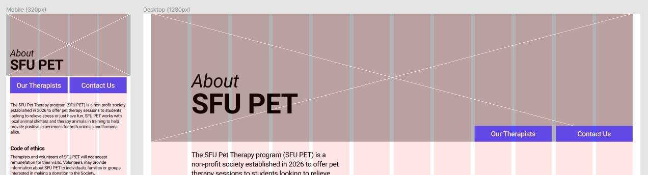
A sample of a medium-fidelity mobile and desktop wireframe in Figma. Your own structure and layout should explore different ideas than the image above.
Bring to your March 4 lab
- A list of guidelines and rationale
- A URL to Figma wireframes that contain your mobile and desktop resolution wireframes
We will discuss your deliverables in lab.
From March 4 to March 11
Working with the feedback you have received, as a group create a final set of interactive wireframes for mobile and desktop sizes. Make sure to have followed the rules:
- Use Find Your Climate Community flowchart content. You are permitted to reorganize and restructure the content.
- Use only the Regular, Italic, Semibold, and Semibold Italic weights of Open Sans and Bold weight of Montserrat (these fonts are already available in Figma).
- Only permitted are the following colours:
- Black — 0,0,0 (RGB) or #000000 (HEX)
- White — 255,255,255 (RGB) or #FFFFFF (HEX)
- Dark gray — 77,77,77 (RGB) or #4D4D4D (HEX)
- Light gray — 179,179,179 (RGB) or #B3B3B3 (HEX)
- Blue — 80,80,255 (RGB) or #5050FF (HEX)
- Use a consistent grid structure.
- Show the hierarchy of content.
- Show the layout of content.
- Link sections together as needed.
- Use hash-boxes to indicate where images would go.
Grading rubric
Grading for this project focuses on the final wireframes. Please email Andrew with any questions about the rubric.
| A | B | C | D/F | |
|---|---|---|---|---|
| Teamwork (4 points): | Team contract has been completed and all weekly teamwork reflections completed (graded individually). | Team contract has been completed and one weekly teamwork reflections missing (graded individually). | Team contract has been completed and two weekly teamwork reflections missing (graded individually). | Team contract is missing and two weekly teamwork reflections missing (graded individually). |
| Followed the rules (2 points): | All rules — detailed in the project — are followed. | Up to two rules — detailed in the project — are not followed. | Up to three rules — detailed in the project — are not followed. | Four or more rules — detailed in the project — are not followed. |
| Design (10 points): |
|
|
|
|
| Consistency (3 points): | Visual treatment of elements — headings, links, buttons — is consistent across all desktop and mobile wireframes. | Visual treatment of elements — headings, links, buttons — is mostly consistent across all desktop and mobile wireframes. | Visual treatment of elements — headings, links, buttons — is inconsistent across some desktop and mobile wireframes. | Visual treatment of elements — headings, links, buttons — is inconsistent across all desktop and mobile wireframes. |
| Grids (3 points): | There are no concerns with the use of grids which establish an effective layout. | There are a few concerns with the use of grids, but they still establish an effective layout. | There are many concerns with the use of grids which makes a somewhat understandable layout. | There is little-to-no use of grids which hinders the understandability of the layout. |
| Responsive design (3 points): |
|
|
|
|
Final submission requirements (March 11)
The final submission for P3 is:
- A list of design guidelines and rationale (can be embedded in the wireframes or as a comment in Canvas)
- A URL to your interactive wireframes for both mobile and desktop
Your project submission is due to Canvas before your March 11 lab.
Please make sure double-check all your submitted files and URLs to ensure they can be opened. We want to avoid late or problematic submission penalties whenever possible.