ah teaches information design (Users and you lecture)
Users and you
Lecture outline
How to think about and test with the people you are designing for. Lecture slides will be made available on the day of the lecture (November 5).
In preparation for lecture...
Please close up any laptops, cellphones, Google Glasses, Discmans and other 'beep-boop' devices.
:focus and images
You cannot use the keyboard to navigate to an <img> element as they are not interactive elements. You will have to wrap it in an interactive element to style it upon interaction:
 a:focus img {
	/* this selects an img inside of a anchor that has focus */
}
section
A <section> only makes sense if there is a heading with content.
 <section>
<h2> Kittens are cool </h2>
<img src ... >
</section>
P2 grading
We are going to try and turn around grading on P2 quickly to give you a sense of where your project stands before you go too deep into P4.
Uploading files
Your next project requires that you upload files. We will be generating filespaces for you to use in the upcoming project this week and will cover how to upload files next week.
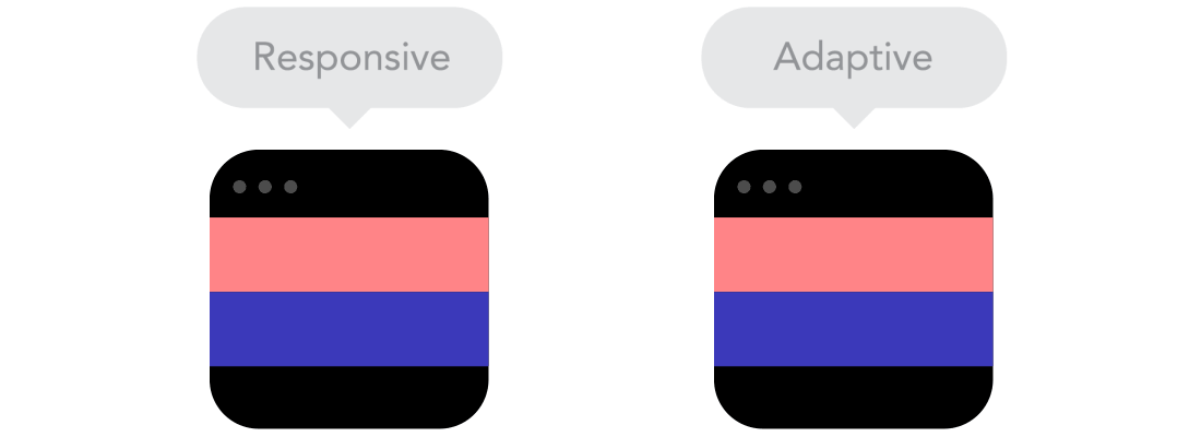
Elements of Responsive Design
The pieces you need:
- Relative units
- Fluid grids
- Media queries
Relative Units
Oops, this code did not quite load. Please view it at https://codepen.io/andrewhaw/pen/934c46233e45d31277ac08e351ed892f
Parent & Child Elements
Oops, this code did not quite load. Please view it at https://codepen.io/andrewhaw/pen/9fadf35fe1d4ec950e5e8bc7730bddd2
Flexbox
If you need support for flexbox, I recommend The Flexbox Cheatsheet Cheatsheet (Joni Trythall).
Grids help
If you need support for grids, I recommend A Complete Guide to Grid (CSS Tricks).
Flexbox or grids?
Do you want to let your content control the way it is displayed, on a row by row or column by column basis? That's flexbox.
Or, do you want to define a grid, and either allow items to be auto-placed into the cells defined by that grid, or control their positioning using line-based positioning or grid template areas. That's grid.
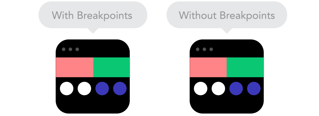
Points on Breakpoints
Where and when should our web layout collapse?
- Let your content decide
- Use relative units (always)
- Grids are your bestest friends
- Avoid an absolute process
Code tutorial
Get set up with today's code tutorial files at 235.ah.link/t03