P2: Layout (due October 28/29)
This is old content
Andrew is not currently teaching IAT-102. This material is left online for reference only.
Introduction
Continuing from P1: Process, this project has you laying out a digital magazine to practice working with type and composition. You will be designing your layout for a 1280PX-wide display that can scroll in any direction.
P2: Layout is done in teams of 2-3, and is worth 20% of your final grade.
Weekly instructions
This project spans multiple weeks. Please read the weekly instructions carefully.
From October 7/8 to October 15, Tuesday
This week is about organizing your group and agreeing on how you will approach the layout.
- As a group agree upon which of your first project directions you would like to pursue. Make sure that you agree on:
- A title for your article.
- 3 sub-headings that will appear in your article.
- An initial collection of possible photos for use in the layouts.
- Individually choose 2-4 fonts for your article. Make sure to:
- Identify what each font is meant for, such as headings, captions, bodytype.
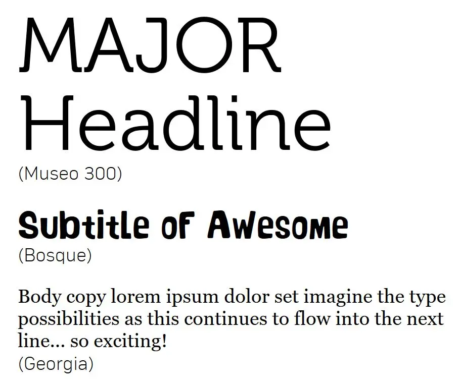
- Look at the combinations and consider how they balance (weight, scale, style); an example is provided in the image below.
![Three different typefaces shown at different scale to help demonstrate the intended hierarchy of type.]()
An example of showing a hierarchy and combination of type.
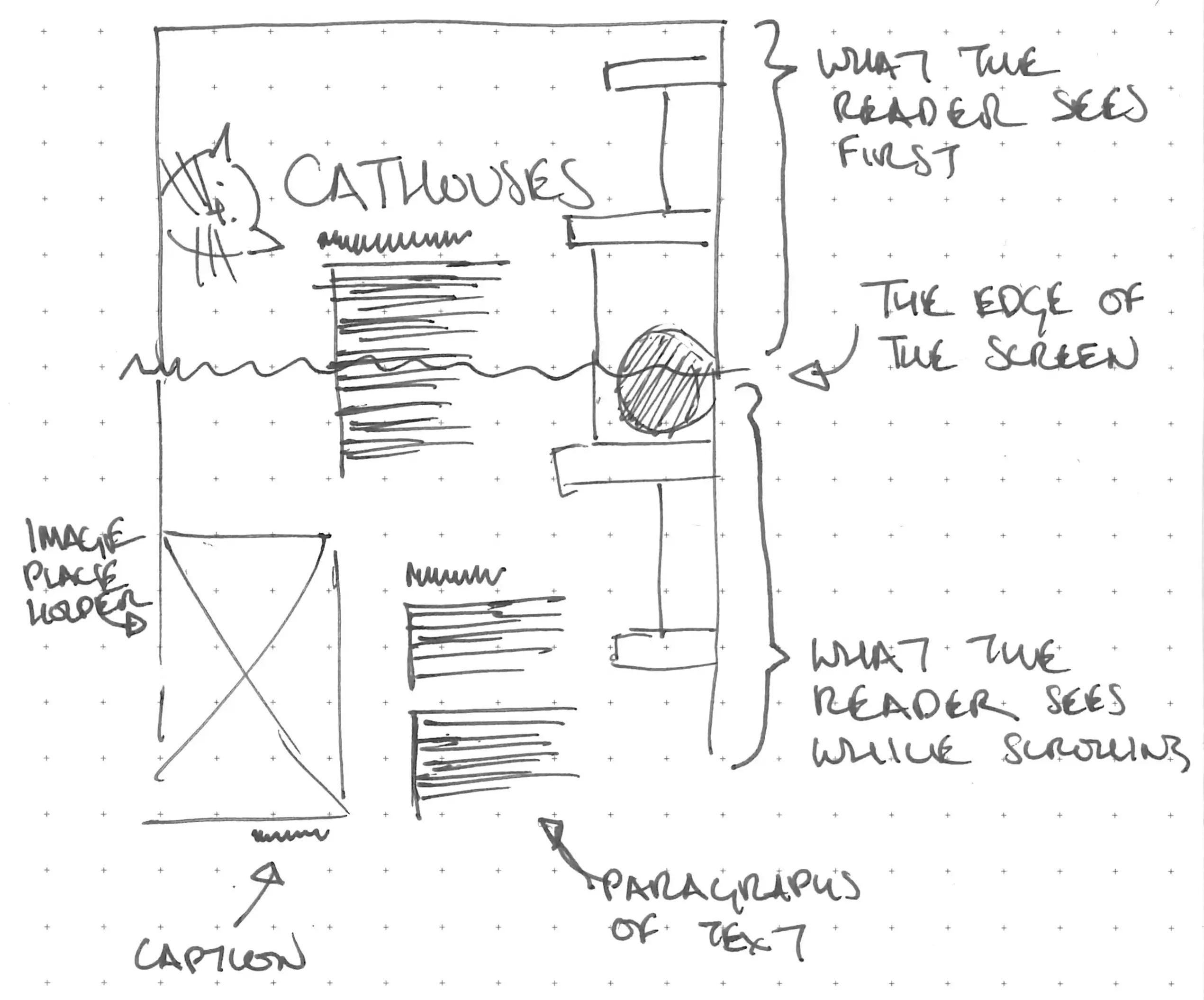
- Individually sketch 30 possible layouts, ensuring the sketches are no wider than 5cm (2 inches) across. Make sure to start exploring:
- Different hierarchies of type
- Relationships between the image and the text
- Approaches to composition for the layout
- Consider the navigation/scrolling through the layout
![Two thumbnail layout sketches]()
A sketch demonstrating different composition and relationships between text and image
Bring to your October 15, Tuesday lab
As a group:
- A title for your article.
- 3 sub-headings that will appear in your article.
- An initial collection of possible photos for use in the layouts.
Individually:
- A set of 2-4 fonts for your article
- 30 possible digital magazine layouts
We will chat about your deliverables lab.
From October 15, Tuesday to October 21/22
This week is about starting to work on your magazine layouts digitally.
You will be working with the following constraints:
- Include one main title
- Include three sub-headings
- Only use two-person placeholder text (for groups of two) or the three-person placeholder text (for groups of three) for the article body text
- All images that are not 'decorative' must include captions
- As a group, set up and share a common Figma file. This file should include:
- Pages and margins
- Grid structures
- Required text content
- Article title and sub-headings
- Images
- Fonts
- Individually create one complete digital layout option for the article. Consider:
- How can you keep the flow of content through the article consistent?
- How can you clarify the relationship between the images and text?
- How can you help the reader understand how to move through the text?
Bring to your October 21/22 lab
A link to your digital magazine layout.
From October 21/22 to October 28/29
This week is about combining your ideas into one final layout. We will hold a large critique of your work so far to provide more direction for the final week. In the final week you are creating one final digital magazine layout as a group.
Grading rubric
Your project will be graded on the following criteria:
| A | B | C | D | |
|---|---|---|---|---|
Typography (5 points):
|
|
|
|
|
| Composition (5 points):
|
|
|
|
|
| Unity (5 points):
|
|
|
|
|
| Fulfilled requirements (3 points):
| All requirements completed. | Missing one of the requirements. | Missing two of the requirements. | Missing three of the requirements. |
| Formatted document (1 pt) | Document is formatted as a 1280 pixel wide, scrolling page. | Document is formatted as a scrolling page. | ||
| Citations (1 pt) | Citations are provided in a consistent, standard (APA, MLA, or otherwise) format. | Citations are provided in a consistent, non-standard format. | Citations are provided in an in-consistent format. | |
Final submission requirements (October 28/29)
The final submission for P2 is a URL linking to your Figma file including:
- Your final digital magazine layout
- A citation list
Your project submission is due to Canvas before your October 28/29 lab.
Please make sure double-check all your submitted files and URLs to ensure they can be opened. We want to avoid late or problematic submission penalties whenever possible.

